-
Architects: Hosoya Schaefer Architects
- Area: 17000 m²
- Year: 2022
-
Photographs:Rasmus Norlander, Valentine Jeck
-
Lead Architects: Markus Schaefer, Hiromi Hosoya

Text description provided by the architects. The Mobility Hub Zug Nord (MHZN) is a mobility hub, parking structure, retail area, and public space at the same time. Located at the entrance to the TechCluster Zug and the urban district of Zug Nord, the MHZN offers parking space for the employees of the TechCluster and for the public, as well as transfer options to bike, scooter, bus, or a future autonomous shuttle service. With a photovoltaic pergola, connection to the area energy network, charging stations, and flexibility for autonomously parking vehicles, the building is also technically planned with foresight.

A specialty store for craftsmen and a bistro are bringing additional life to the area. Context. The MHNZ is part of the TechCluster Zug development project, which is transforming the V-Zug factory site into a future-oriented location for urban industry in several phases. Industrial processes are verticalized, new companies are offered space, and other urban uses, even apartments, are made possible. The transformation has been overseen by Hosoya Schaefer Architects since winning the international competition in 2013 and is expected to be completed by 2048.


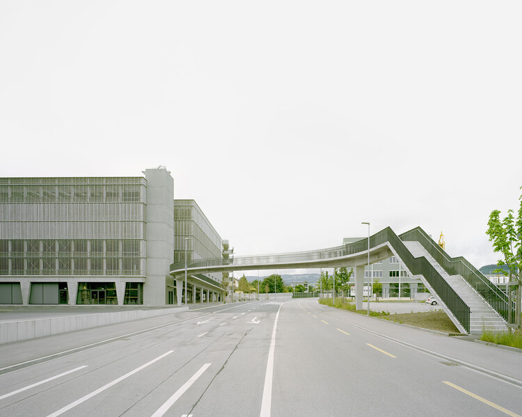
Façade. A cladding made of wooden lamellas serves as privacy and glare protection and takes into account the desire for the greatest possible sustainability. Divided per floor, with alternating orientations and assembled from small and wide slats, the lamellas give a different impression from each direction, changing from opaque to transparent. The façade appears finely structured and seems to start moving when passing by. About 100 m3 of fir or spruce from Swiss forests were used for the 2’254 m2 wooden surface.


The facade is supplemented by anti-glare protection and safety cables in the parapet area. The Bridge. The footbridge swings away from the building as an extension of the balcony lead in an elegant S-curve girder across the street and connect the TechCluster area with the drive-up area on the first floor. The bridge is a three-span frame with spans of 20, 31, and 13 m and required extremely precise formwork to ensure the slender shape. The prestressed beam has a T-section with variable height and width. The prestressed bridge girder is connected to the columns, the foundation of the stairway, and the building to form a monolithic framework.

Concrete/ Structure. The base of the building up to the ceiling of the sales floor is made of in-situ concrete and insulated on the inside. On top of this stands a steel structure with column-free, sloping and horizontal parking spaces that spiral upwards. Its loads are transferred to the distinctive V-shaped supports via a surrounding beam, which in the façade plane moved slightly inwards giving the building a certain lightness. The ramps on the lower and upper floors reflect the swing of the pedestrian bridge and, like the lift tower and shaft, are articulated with matrices.

Signage. The subtle yet strong and clear signage underscores the building's minimalist material and color concept. Typography and pictograms in black and shades of gray are applied directly to the vertical and horizontal surfaces, reducing the overlay of information. The massive aluminum signage attached to the lift tower's textured concrete walls positions the building in the neighborhood. The static and dynamic elements of the signage and the parking guidance system are coordinated.


